Sometimes change is good,
sometimes it's a step backwards. The following college teams, in no
particular order were better off with the old look on the right.
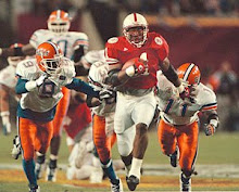
The old school stripes on Vinny's jersey harken to the days when the "U" was too legit to quit. Once foolishly advised to drop its program,
the Canes restored the luster, only to lose it again. Bringing back the
traditional stripes would be a step in the right direction.
If
Syracuse intended to take it's orange and shade it closer to sweet
potatoes, mission accomplished. Numbers on the helmet might be an
improvement, but having a dog pick the hue was a no-no.
BYU
has had several recent incarnations, but most recently a traditional
approach in dark blue and white. This look is classic, yet so classic
they look like Penn State from straight on. The Steve Young era lighter
blue would be a better, and more unique fit.
Pitt
took the curlicue script from Marino's days and turned it into a gothic
font in all caps. Possibly more menacing, but hardly a logo one wants
on the breast of their golf shirt. The lighter shades of blue and gold
from the 70's are more pleasing on the eye.
Two
years ago Florida unveiled their uniforms from the 50's for the Alabama
game. The biggest improvement was replacing the cursive Gators and
orange helmet, for a white one with block "F." Don't agree? Take a look at this Wolverines' photo evidence. The Roman stripes over the shoulder make this a look the Gators never should have left.
Monday, May 12, 2008
When Old School beats New School
The Whiz previously wondered if I'd forgotten Oregon. Surely not an oversight, they are just in their own league.
Subscribe to:
Post Comments (Atom)


0 comments:
Post a Comment